Decorating With Art
For us, art is rarely something that is simply added at the end of a project.
A painting, an old frame, a particular colour in a print or even a collection of pieces a client already owns can be the thread that brings a room together. It can dictate a wall colour, inspire the choice of fabric or introduce a colour combination that might not otherwise have been considered.
We love interiors that feel as though they have evolved around the things people love, rather than having been created from a single scheme.
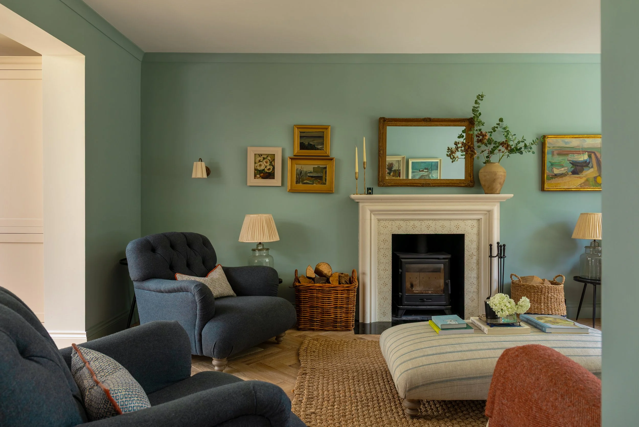
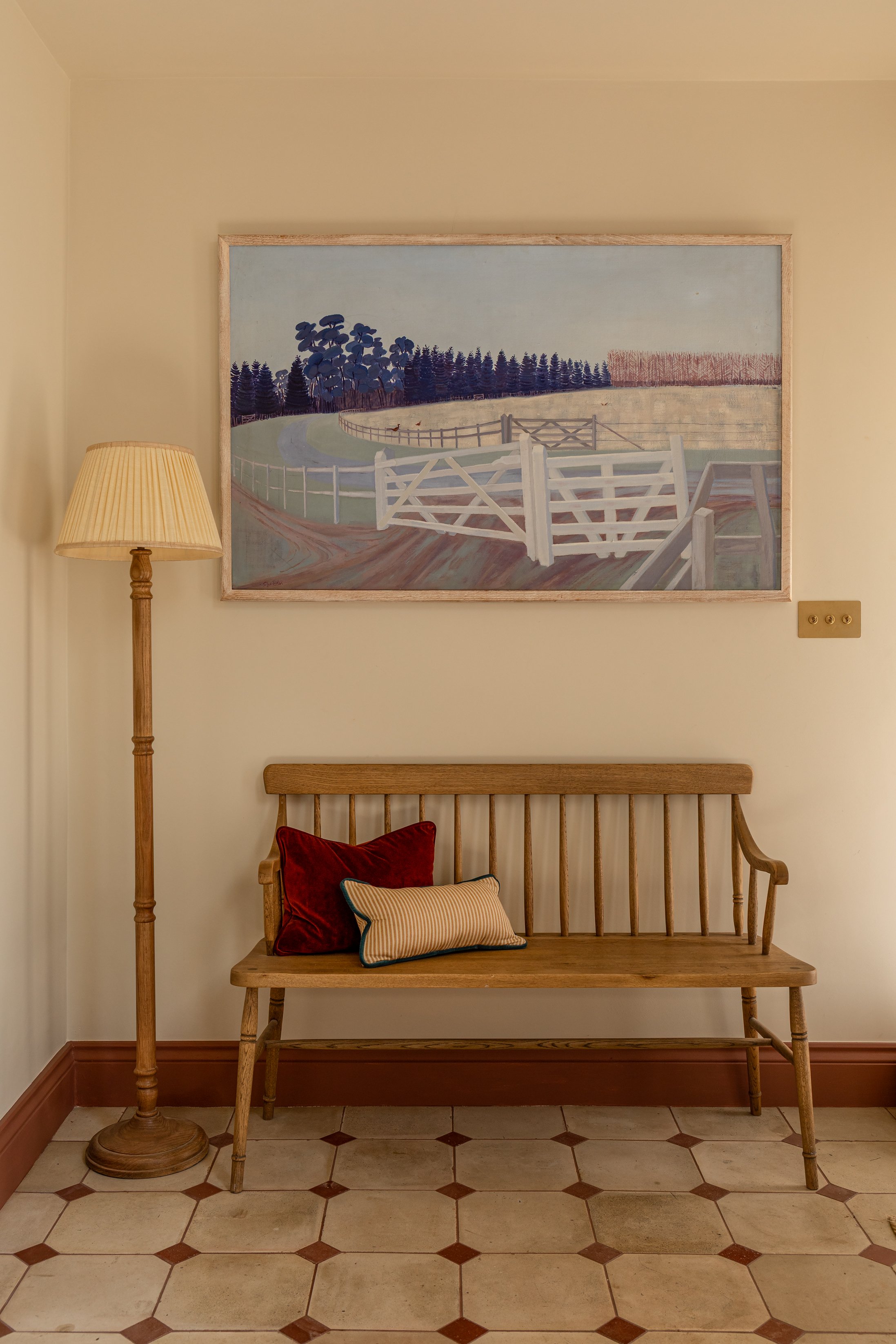
Start with something you love
When we are designing a room, we often find it more interesting to start with something that already has character.
It might be a painting that has been in the family for years, a print picked up on holiday, or simply an image with a colour combination that catches your eye. Rather than trying to make everything in the room match it, we look at the colours within it and ask: what else could sit alongside these?
Perhaps there is a soft, chalky blue that could become the wall colour. A little flash of earthy red that could appear in a cushion or lampshade. A warm yellow that could be picked up in a vintage chair.
The result is a colour scheme that feels connected without being too obvious.
One of our favourite ways to use art is to look past the colour that immediately catches your eye.
A painting might appear to be predominantly blue, for example, but look closely and you might find warm ochres, faded greens, soft pinks or earthy browns within it. These quieter colours can be just as useful when building a room.
They can be introduced through upholstery, curtains, rugs, painted furniture or joinery, creating a subtle relationship between the artwork and the rest of the space.
This is particularly useful when working with vintage art. The slightly faded, imperfect colours you find in older paintings can create wonderful palettes that feel softer than something chosen directly from a paint chart.
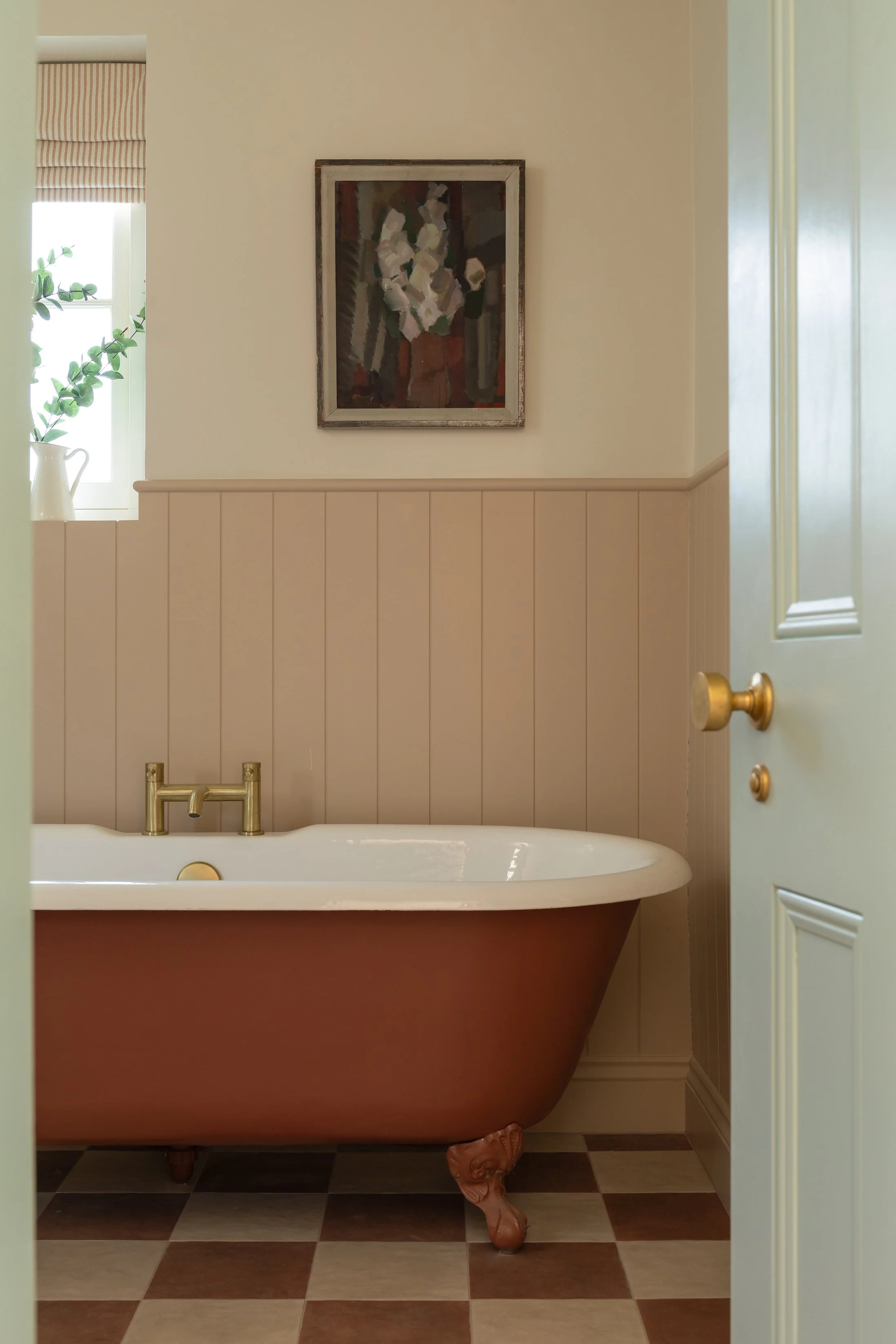
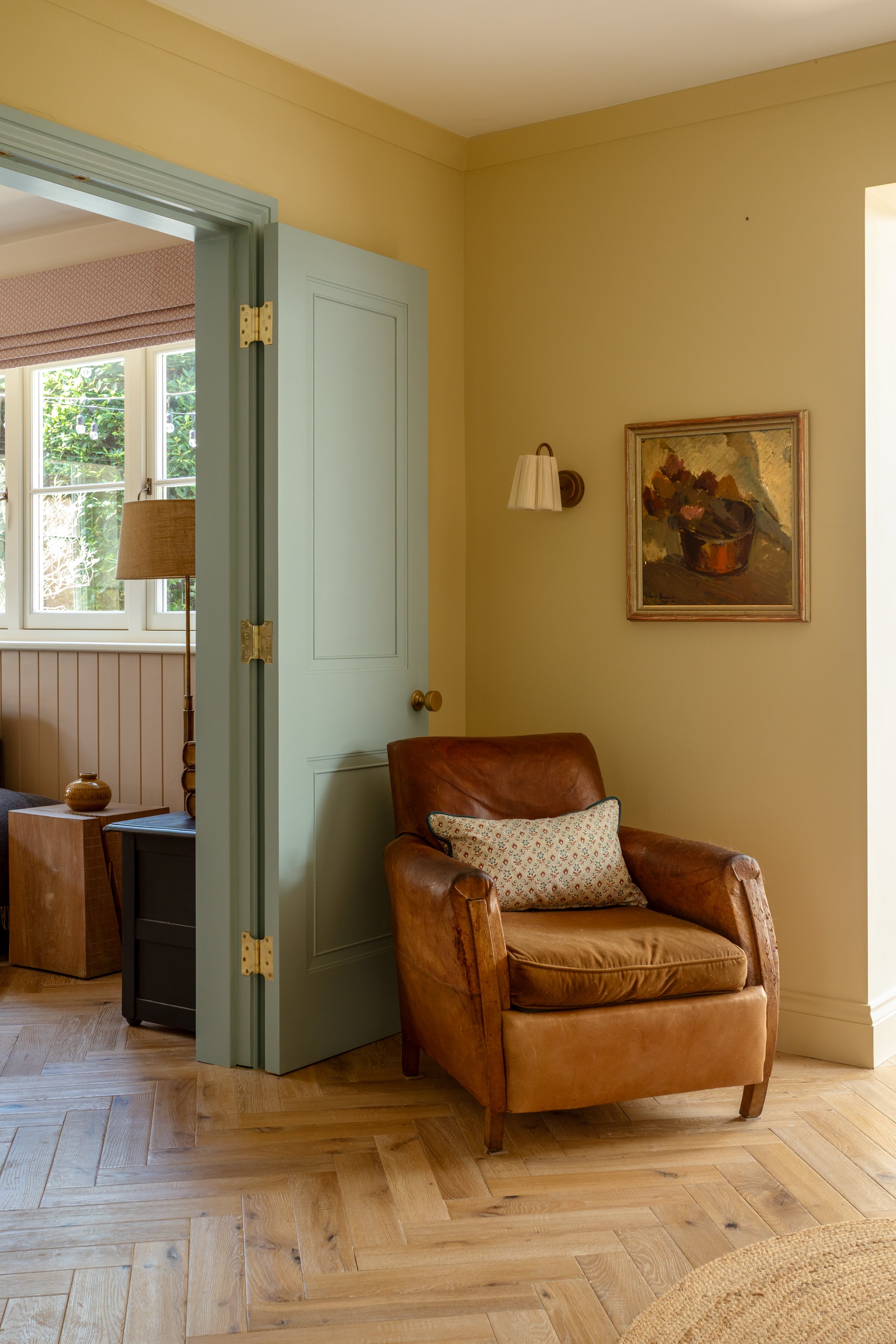
Art can also be a good excuse to be a little braver with colour.
A strong painting can give you the confidence to take a colour onto the walls that you might otherwise have dismissed. Equally a colourful room doesn’t necessarily need colourful art. Sometimes a simple, quieter painting can provide the calm that the room needs.
We love the idea that colour doesn’t have to be used in isolation. The most successful schemes often come from colours being repeated in slightly different ways throughout a room — in the art, the fabric, the paintwork and the furniture.
It is this layering that makes a room feel cohesive without feeling overly coordinated.
Work with art you already have
When designing a client’s home, we always want to know what they already own.
Art is personal, and it can be one of the things that makes a house feel like that particular person’s home. There is no reason to start again just because the interior is changing.
Instead, we look at how existing pieces can be given a new context.
Sometimes that means changing the wall colour behind a painting so that it comes alive. Sometimes it means moving a piece into another room, changing its frame or simply giving it more space around it.
We particularly love interiors where contemporary and vintage pieces sit together. A beautiful old painting doesn’t need to live in a traditionally decorated room. In fact, placing it against more contemporary joinery or alongside modern furniture can make it feel even more interesting.
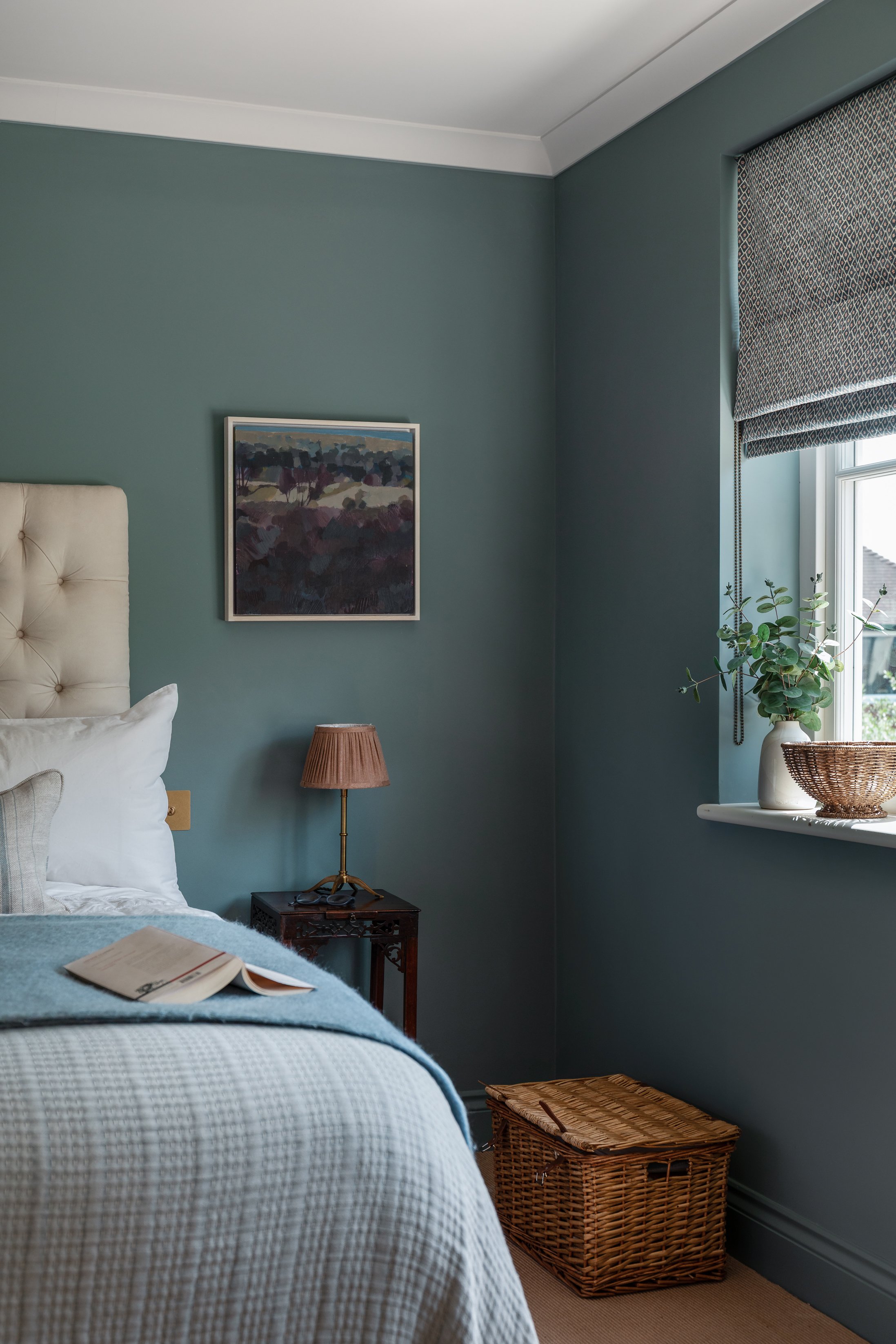
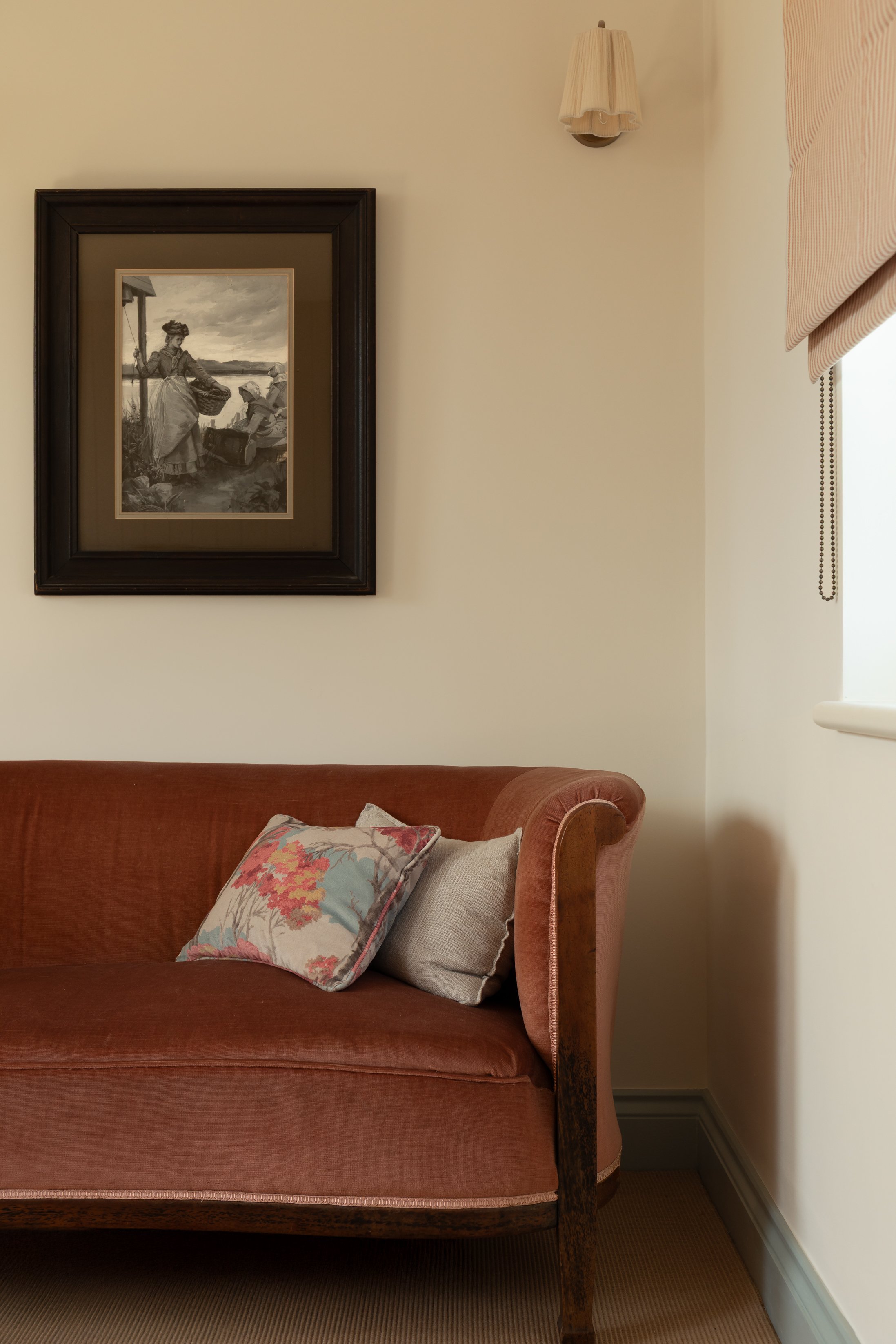
Art should be accessible - you don’t need to spend a fortune to find something that brings personality and colour to your home. In fact, some of the pieces we love most are vintage paintings that aren’t by well-known artists but simply have something about them - an interesting colour palette or a sense of place. They can add just as much character to a room as a more expensive piece.
Through Art Drop London, our online collection of vintage and decorative oil paintings, we source pieces with interiors in mind. We look for paintings that have something special about them and that we would genuinely choose for our own homes. We particularly love mid-century Scandinavian art, alongside pieces from France, Spain and Germany, and enjoy finding artwork that can become the starting point for a whole room.
Art can also be a wonderful way of creating colour continuity throughout a house.
Rather than choosing a completely different palette for every room, we might take one or two colours from a painting and allow them to appear elsewhere in the house. Perhaps a muted green from an artwork becomes the colour of a door or a piece of joinery in the adjoining room. A warm red might reappear in a stair runner or a lampshade.
These connections don’t need to be exact. In fact, we think it is much more successful when they aren’t.
The colours can change in tone and intensity as you move through the house, creating a sense of flow while allowing each room to have its own personality.
Flow
Perhaps the most important thing is that the art shouldn’t feel like it has simply been used as a colour chart.
The aim is to create a room where everything feels as though it belongs together - the art, the furniture, the fabrics, the architecture and, most importantly, the people who live there.
For us, the best interiors are never about following a particular style or getting every element to match. They are about collecting things you love and finding unexpected ways for them to work together.
Sometimes the starting point is a painting. Sometimes it’s a fabric, a beautiful old chair or a colour you’ve fallen in love with.
But when those personal elements are allowed to influence the rest of the room, the result is an interior that feels layered, individual and, hopefully, as though it has always been there.

Our approach
At Hurst + Gillanders, our aim is to create spaces that feel natural and where colours effortlessly flow between the spaces. We don’t believe in restricting the number of colours or the way in which we use the colours. We will always respond to the natural features of your home and the personality of the people living there.
